KNeighborsRegressor 의 문제점: 기존 학습 데이터 근처에서 문제가 나오면 답을 잘 찾아 주지만, 그 범위를 벗어나면 답이 없다. 가령, 생선의 길이를 10~50cm 범위만 학습시킨 후 200cm 짜리 생선의 정답을 달라고 하면 완전 엉뚱한 예측값이 나와 버린다. 해결 방법은 두 가지다. 200cm 범위까지 늘려 학습을 시키거나, KLinearRegressor 를 사용하거나...
Linear Regressor 선형회귀는 y=ax+b 형식의 함수를 만족하는 a 와 b 를 찾는 모델이다.
import numpy as np
# 농어의 길이
perch_length = np.array([8.4, 13.7, 15.0, 16.2, 17.4, 18.0, 18.7, 19.0, 19.6, 20.0, 21.0,
21.0, 21.0, 21.3, 22.0, 22.0, 22.0, 22.0, 22.0, 22.5, 22.5, 22.7,
23.0, 23.5, 24.0, 24.0, 24.6, 25.0, 25.6, 26.5, 27.3, 27.5, 27.5,
27.5, 28.0, 28.7, 30.0, 32.8, 34.5, 35.0, 36.5, 36.0, 37.0, 37.0,
39.0, 39.0, 39.0, 40.0, 40.0, 40.0, 40.0, 42.0, 43.0, 43.0, 43.5,
44.0])
# 농어의 무게
perch_weight = np.array([5.9, 32.0, 40.0, 51.5, 70.0, 100.0, 78.0, 80.0, 85.0, 85.0, 110.0,
115.0, 125.0, 130.0, 120.0, 120.0, 130.0, 135.0, 110.0, 130.0,
150.0, 145.0, 150.0, 170.0, 225.0, 145.0, 188.0, 180.0, 197.0,
218.0, 300.0, 260.0, 265.0, 250.0, 250.0, 300.0, 320.0, 514.0,
556.0, 840.0, 685.0, 700.0, 700.0, 690.0, 900.0, 650.0, 820.0,
850.0, 900.0, 1015.0, 820.0, 1100.0, 1000.0, 1100.0, 1000.0,
1000.0])
import matplotlib.pyplot as plt
plt.scatter(perch_length, perch_weight)
plt.xlabel("length(cm)")
plt.ylabel("weight(g)")
plt.plot([perch_length[0], perch_length[-1]], [perch_weight[0], perch_weight[-1]])
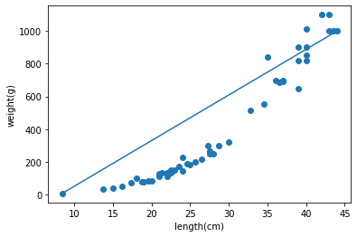
plt.show()이 데이터는 아래 그림처럼 얼추 선형으로 분포되어 있다.
# 기존 배열에서 훈련/테스트로 자동 분류
from sklearn.model_selection import train_test_split
train_input, test_input, train_target, test_target = train_test_split(perch_length, perch_weight, random_state=10) #random_state 가 없으면 완전히 랜덤으로 분류하기 때문에 임의의 숫자로 고정(학습목적)

# X 를 2차원 배열 형태로
train_input = train_input.reshape(-1, 1)
test_input = test_input.reshape(-1, 1)

# 선형회귀
from sklearn.linear_model import LinearRegression
lr = LinearRegression()

lr.fit(train_input, train_target)
print(lr.score(train_input, train_target))
print(lr.score(test_input, test_target))

출력:
0.9256893774592477
0.8105274501581892
선형회귀 모델을 이용해 데이터를 fit 하고 score 를 출력해 봤지만, 양쪽 다 점수가 높지가 않다.
위의 그래프가 얼추 선형으로 보이지만, 좀 자세히 보면 y=ax^2+bx+c 에 가까운걸 직관적으로 느낄 수 있다.
# 훈련 세트에 제곱항을 더함

train_poly = np.column_stack((train_input**2, train_input))
test_poly = np.column_stack((test_input**2, test_input))

test_poly

출력:
array([[ 745.29,   27.3 ],
       [ 484.  ,   22.  ],
       [1225.  ,   35.  ],
       [ 552.25,   23.5 ],
       [ 484.  ,   22.  ],
       [ 384.16,   19.6 ],
       [1600.  ,   40.  ],
       [ 400.  ,   20.  ],
       [1190.25,   34.5 ],
       [1521.  ,   39.  ],
       [1600.  ,   40.  ],
       [ 655.36,   25.6 ],
       [ 484.  ,   22.  ],
       [1332.25,   36.5 ]])
입력값을 제곱해서 X 배열에 추가했다. 이렇게 함으로써 y=ax^2+bx+c 그래프를 어느 정도 흉내낼 수 있다.
# 선형회귀
from sklearn.linear_model import LinearRegression
lr = LinearRegression()

lr.fit(train_poly, train_target)
lr.score(test_poly, test_target)

출력:
0.9708571942978936
0.974407933550333
그냥 선형회귀를 사용했을 때보다 점수가 높게 나왔다.
lr.predict([[2500, 50]]) # 길이 50cm 로 예측해 본다. 입력도 훈련 데이터와 마찬가지로 제곱한 값을 배열 첫 번째에 추가해 줘야 한다.
출력:
array([1543.24221541])
대략 1543g 이라고 예측하였다.
import matplotlib.pyplot as plt

plt.scatter(perch_length, perch_weight)
plt.xlabel("length(cm)")
plt.ylabel("weight(g)")

x = np.arange(0,50)
a = lr.coef_[0]
b = lr.coef_[1]
c = lr.intercept_
plt.plot(x, a*x**2 + b*x + c)
plt.show()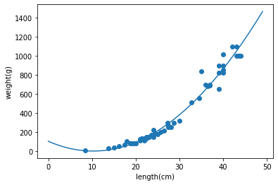
그래프가 원본 데이터 분포에 어느정도 피팅된 모습으로 보인다. (대략 length 가 7이하부터 곡선이 증가하는 구간은 일단 무시한다.)